Stillstar
A calmer daily astrology app.
I built Stillstar to test my skill sets: UI, UX, code and product creation. Could I go from zero to a real app on the iPhone? This is what I tried, the decisions I made and what I learnt along the way.
Index
- Cutting the idea backFrom eighteen screens to a few.
- Letting the artwork decideTen directions. One sign.
- Colour that comes from the artworkFinding the colours that felt right.
- Light and darkThe same app in both.
- Picking a signTry the carousel from the app.
- The signs, the studies and the iconsHow the artwork and logo came together.
- Accounts only when they matterRead first. Sign in when you save.
- How it’s builtThe choices behind the app.
- Where it stoppedWhat I learnt and took into the next one.
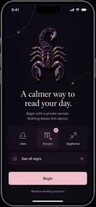
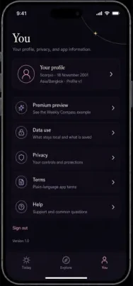
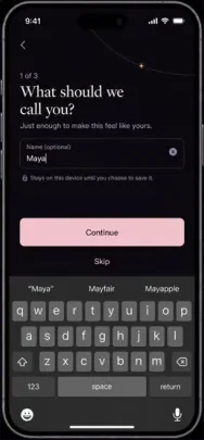
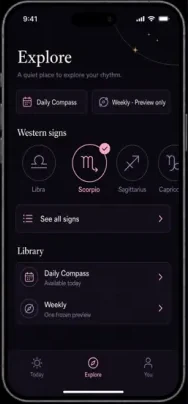
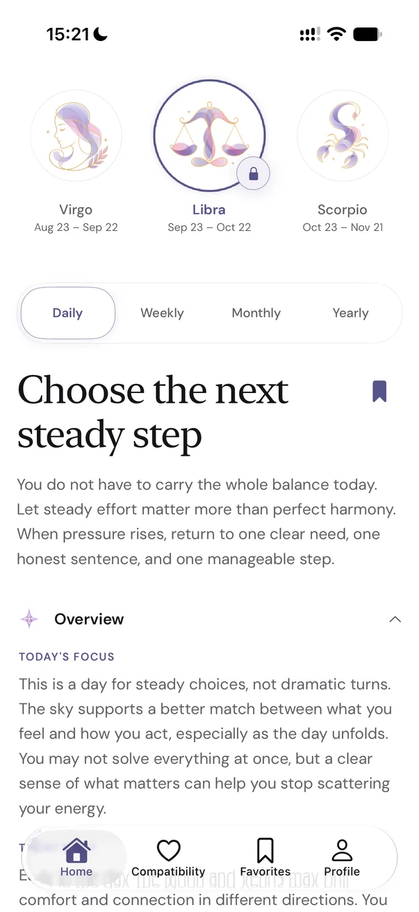
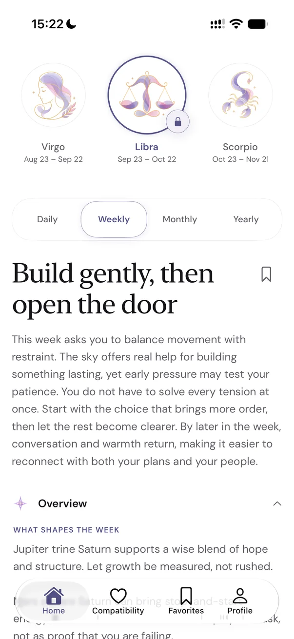
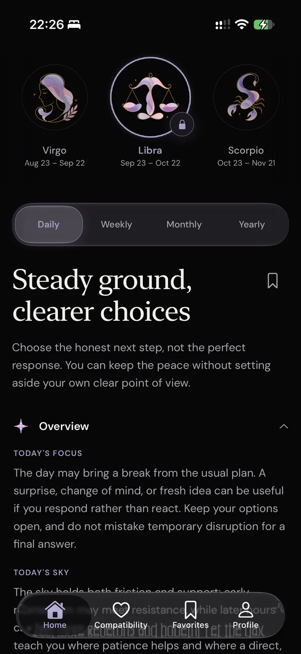
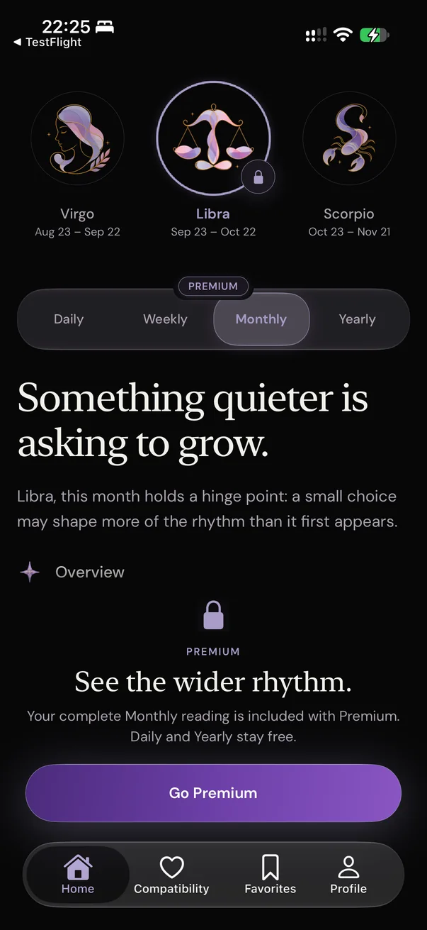

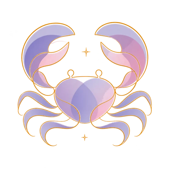


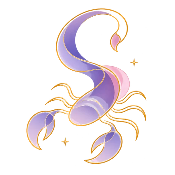
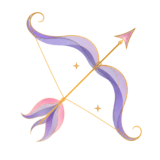
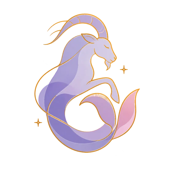
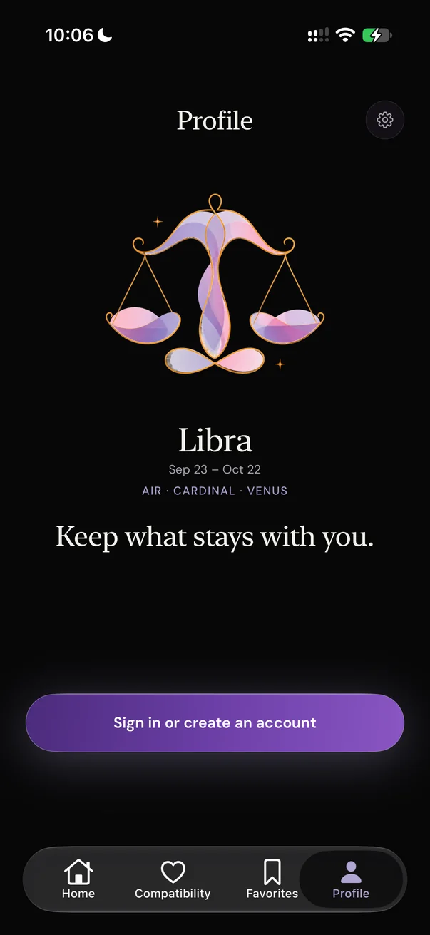
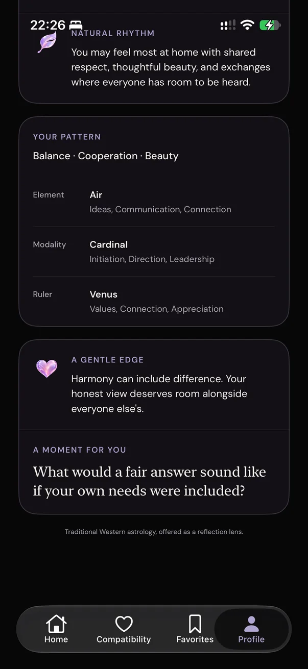
Cutting the idea back
The first mockups had eighteen screens, and before that there was even more. Chinese signs, questions about your name and birth date, an Explore tab, a reminder. I’d even built a birth-chart engine.
Then I realised I was doing the same thing I didn’t like in other astrology apps. There was too much going on. So it became a question of what actually gives someone value, and what I could take away. I kept narrowing it down. Less is more.
Letting the artwork decide
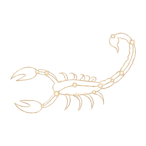
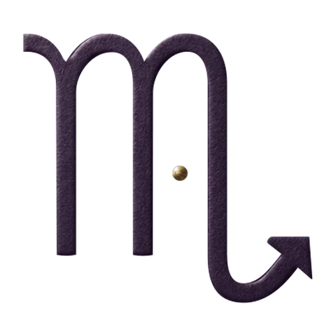
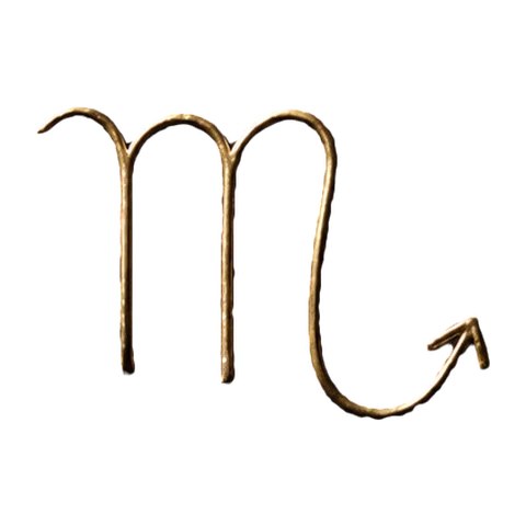

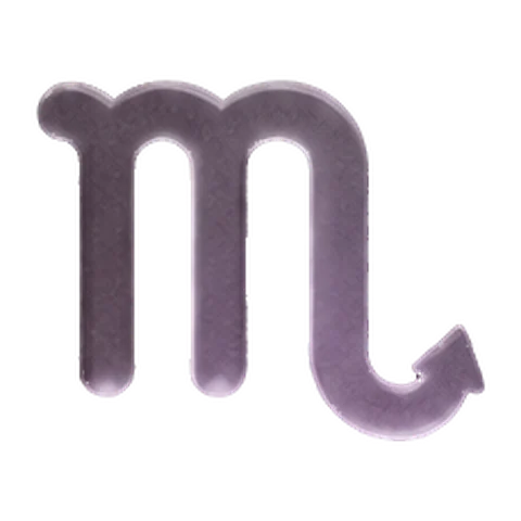
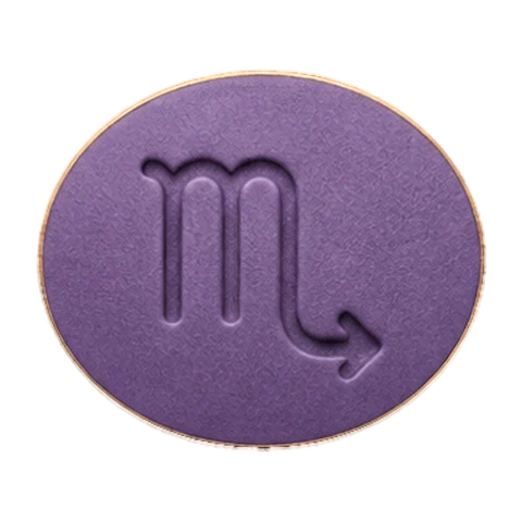
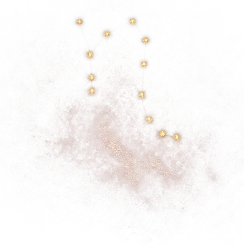
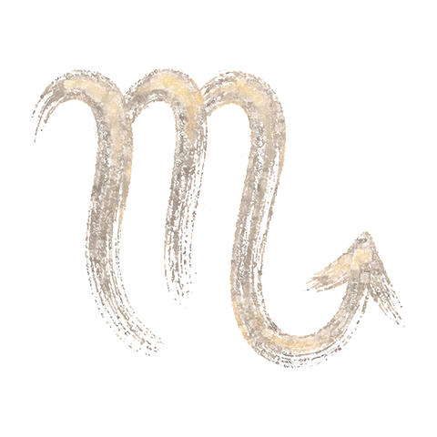
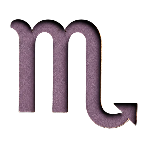
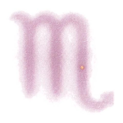
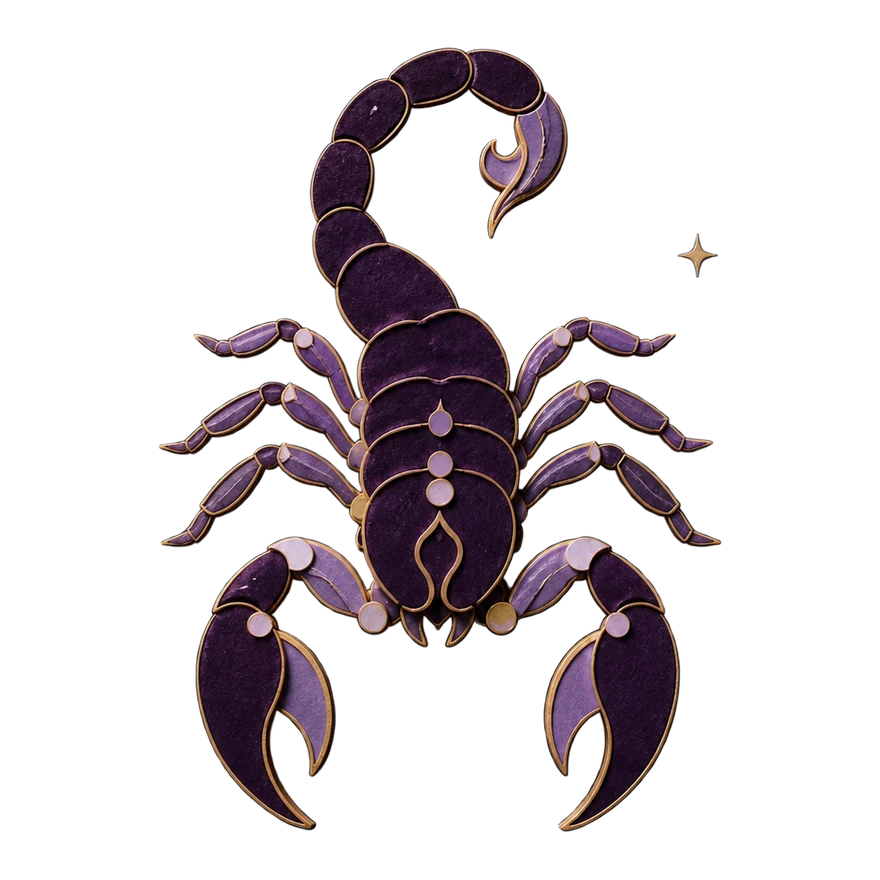
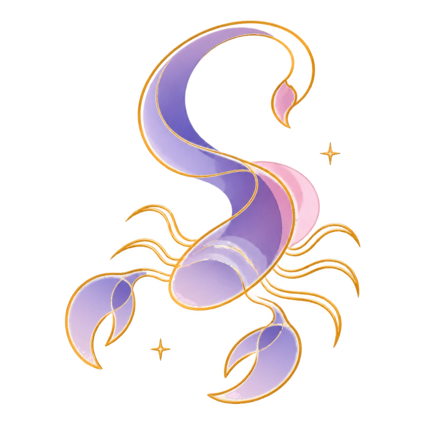
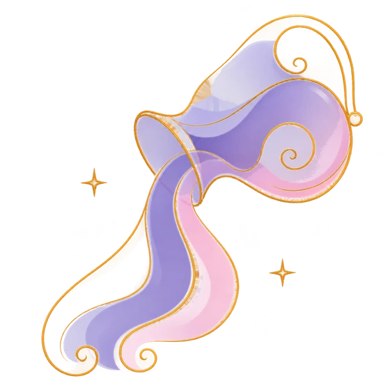
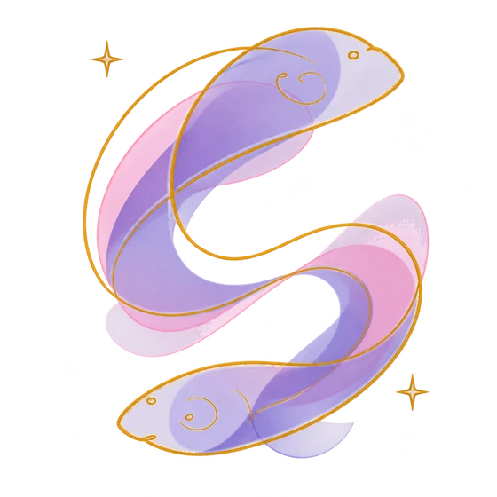
I started with one sign, Scorpio, and tried ten different directions before designing the screens. Everything from a single gold line to an enamel seal.
Velvet Relief was my favourite. Layered paper, thin gold edges and a single star. At that point, I really thought this was the one I’d go with.
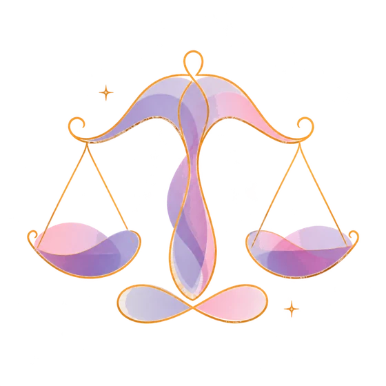
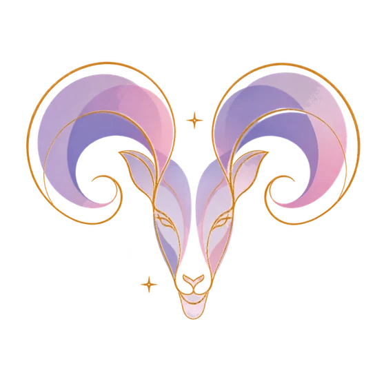
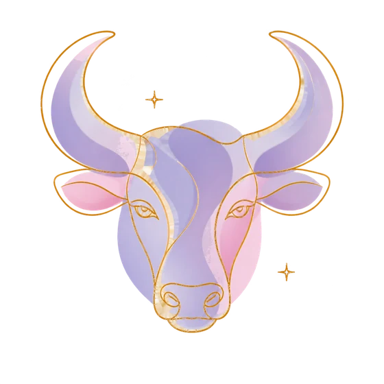
The imagery and colour system were probably the hardest decisions in the whole app. I loved so many of the directions, and it was very hard to pick a favourite. So I asked a handful of friends and family what they felt more drawn to. Velvet Relief and Luminous came out on top, with Luminous the clear favourite. Sometimes you have to trust your instincts, and sometimes it’s okay to listen to the feedback and adjust. I was learning to narrow down and make a decision. You can always iterate.
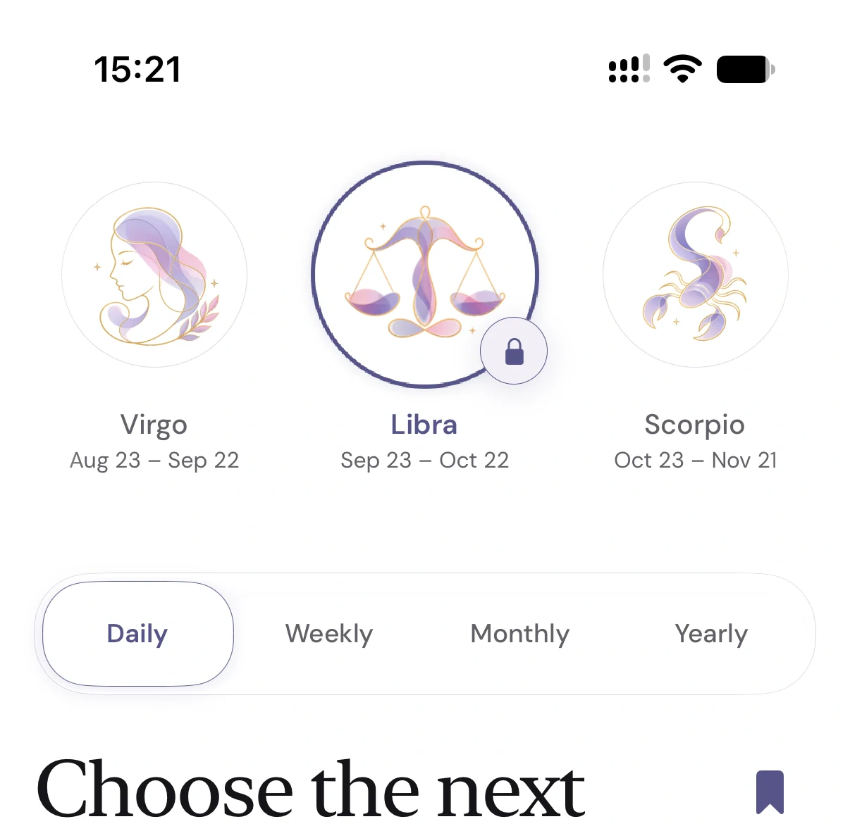
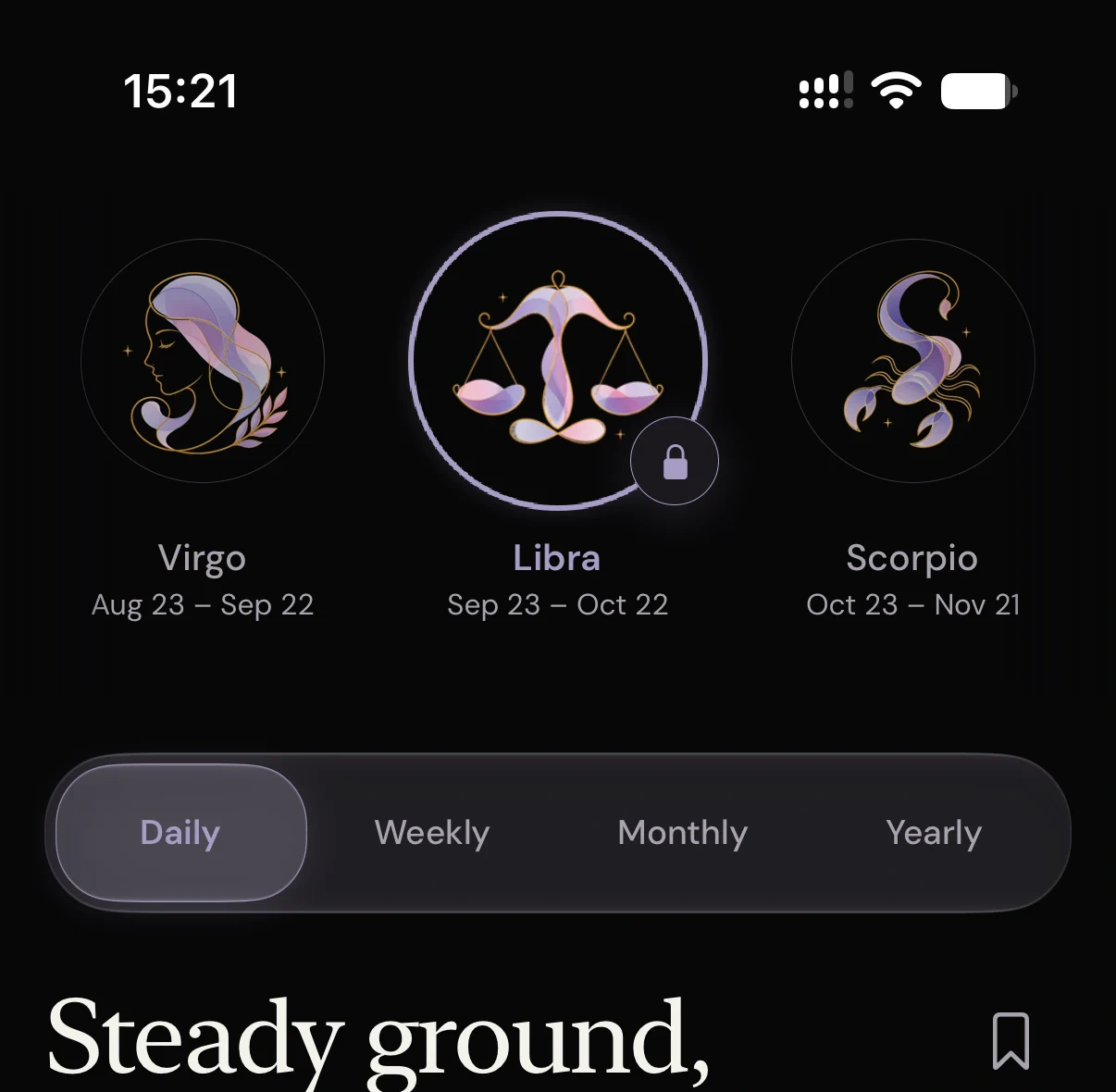
LibraSep 23 – Oct 22
“One thing about code that’s beautiful is that you can always change it. It’s not one thing forever.”
Neutral
Indigo
Rose
Colour that comes from the artwork
I wanted the artwork to be the thing you notice, so I kept the rest of the app quite simple. Mostly white and near-black, with purple for the artwork, the selected state and premium.
The palette changed twice. It started in plum, then I kept taking colour out until I got here.
Taste changes all the time. This was the direction I liked most in the end.
Moonlit Orchid
White and gold
Luminous
Light and dark
I kept the same layout and artwork in both. The background goes from white to almost black, and the purple changes with it: deeper indigo on white, softer lavender on black. I wanted it to be just as clear which sign you’ve selected in either one.
Picking a sign
You open the app and there are the twelve signs. As you scroll, the sign in the centre grows into place. Once you stop on one, the reading below changes. I wanted that to feel simple and intuitive.
The signs, the studies and the icons
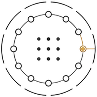
The logo came before the name. I tried a few directions, and the one I liked most was an orbit with one star lit up among the others.
Only afterwards did I see the meaning in it: everyone has their own star, and the one that’s lit up is you. Then I named the app Stillstar to fit it.
It started in gold. When I chose the Luminous signs, I changed it to their purple so it all felt like part of the same app.
Accounts only when they matter
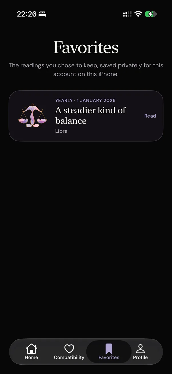
Originally, I asked people to create an account during setup, before they’d even read anything. Looking at it again, there wasn’t a reason to ask that early.
So now you can open the app and read straight away. It only asks you to sign in when you want to save a reading. At that point, the account actually does something for you.
How it’s built
Stillstar is built with React Native and Expo, with Supabase behind it. Moving to React Native was a turning point for me. I started in Swift because I wanted to learn iOS, but I was spending more time learning new concepts than working on the actual app.
React Native was much more familiar. I could understand the code, be more creative and put things out there faster, while still keeping a high standard for the code and security.
The readings are written ahead of time and checked against what’s actually happening in the sky before they appear in the app. These were four of the decisions behind it.
Budgeted
Keeping the AI costs under control
Every call uses some of the budget. At the limit, it stops. A language model writes the readings, and every call costs money. I didn’t want a retry in the wrong place to use up a month’s budget in an afternoon.
So I put the budget in the database: USD 45 a month, with a hard stop at USD 50. The cost is reserved before each call and settled afterwards. That way, keeping costs under control didn’t depend on me remembering the limit in every new bit of code.
Grounded
Checking the readings against the real sky
- Mercury squares Mars. Speak slowly.
- The Moon enters Cancer. Stay close.
- Venus turns retrograde. Old ties return.
- Luck finds you on Tuesday.
Each sentence highlights the event it refers to. If there’s no event to back it up, it’s crossed out. The model can describe a planetary event that isn’t actually happening. If you know astrology and spot that, why would you trust the rest of the reading?
So I work out the real events first and only let the model refer to those. A better prompt can help, but I still wanted to check what came back against the actual facts.
Checked
Checking purchases on the server
The purchase waits while the server checks the certificate chain back to Apple’s pinned root. Once it passes, the purchase completes. If you pay for a subscription, it needs to work on any phone you sign in to. So the purchase has to be checked on the server.
I built that check myself because I wanted to understand how Apple’s purchases work. It passed on my machine, then broke on the server during TestFlight. That was a lesson in testing where the code actually runs.
React Native made a lot of things easier for me, but there were still extra hoops when working directly with Apple. Next time I’d use RevenueCat.
Private
Keeping the tables closed
The app calls a server function, and that function reads the table. I didn’t want a forgotten setting to leave a table open to anyone. So I closed access to every table and made the app go through server functions instead. That way I could write and test each way the app gets to the data.
Built with Expo 57, React Native 0.86, Reanimated 4.5, Supabase, expo-iap and astronomy-engine, checked by node:test, Deno tests and pgTAP.
Where it stopped
Stillstar made it through TestFlight and into App Review, but Apple didn’t approve it. There were already a lot of similar astrology apps, and they didn’t see enough difference in this one.
I reached out to them. I could have added more features and tried again, but at that point I wanted to focus on other things. So the decision was: take the lessons I’d learnt and move on.
It was a little frustrating because of the time I’d put in, but it didn’t feel too bad. I’d gone from an idea to a working app, learnt new workflows, integrated AI and got a much better understanding of how everything fits together. That gave me the confidence to start the next one.
Next time I’d research the market more and put the app in front of Apple earlier. There were things I only learnt once they reviewed it, and I’d rather get that feedback sooner and keep updating.
Speed plus iteration is much better than perfection.
Stillstar was my first app. For me, it’s a foundation of knowledge I can build on. Nara is where I took that next.
Contact
The best way to reach me is by email.